BIG Decisions!
Are you ready to delve in?! First I thought we'd explore the bigger items and how the scheme started coming together, then I'll take you through all the handmade details that make it extra special. Sound good? Let's go!
First things first: when I'm doing a whole house renovation (this is my 5th!) I find it helpful to come up with an overarching theme. Try to keep it to just one word, to keep your mind really focused - get your flipchart & post-its out if you need to, brainstorm it with your other half or your pals, and make sure it speaks to your heart. For this particular project my chosen word was "LAYERS". See if you can feel it coming through...
Decision no. 1: The Walls
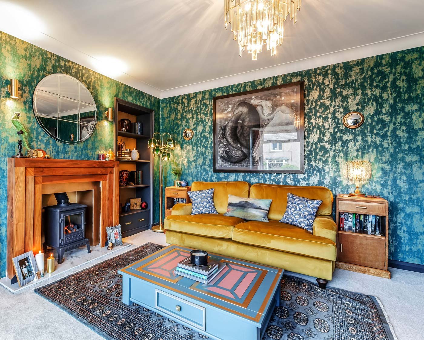
I wanted something moody, with texture, but not too dark, so I landed on this Milan Metallic Wallpaper in Emerald from ilovewallpaper.co.uk It's not actually textured but the rough metallic, industrial print gives the room real depth. When I go wallpaper I usually go FULL ON, so all 4 walls. That's a personal preference but for me I feel it gives a scheme strength - you've had the courage of your convictions, you're not trying it on for size, not dipping a toe, you're GOING FOR IT! It's never not paid off for me, never felt overwhelming, and it really helps to give that sensation of a room enveloping you in a warm hug.
Decision no. 2: The Sofas
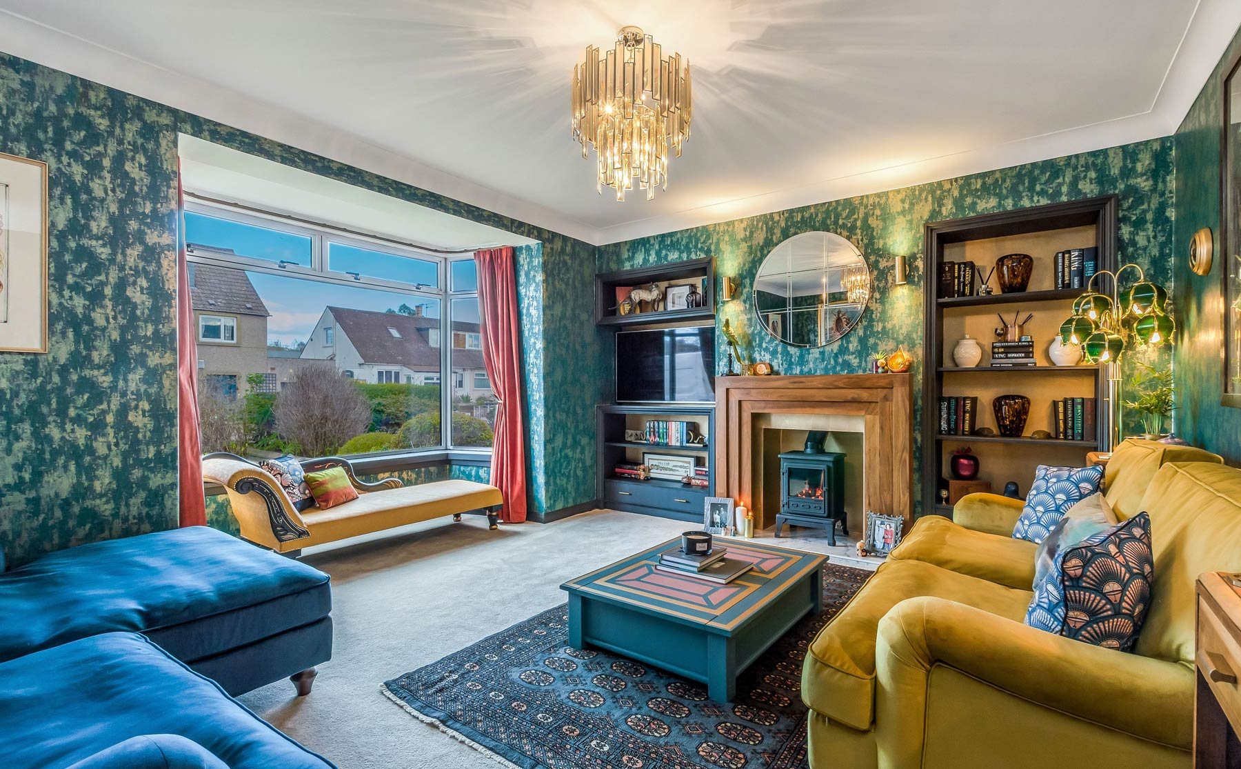
Some people love this, some find it soul destroying, and I'll be honest after our 5th shop we were somewhere in between! If I can make one recommendation it's this - tape your preferred sofa out on the floor BEFORE you buy it! I always tape out large furniture before I buy it (or draw a scale plan, like a total nerd!) Our lounge is pretty big because of the bay window, but even at that it turns out we couldn't fit the sofa we originally chose!
Modern sofas have become very deep, so even though the lengths were fine, their 1m+ depth meant that the space left between the two right-angled sofas would have created a very narrow "corridor" upon entering the room. It's important to stand at your doorway, open and close the door, and imagine stepping into the room for the first time - what do you want the space to feel like? If you want it to feel open and welcoming, a tight sofa-corridor is a no-no!
So, make sure to tape all the dimensions out, including considering the height if you've got a dado rail, wood panelling, low wall lights or large artwork - the last thing you want to find is that your new sofa fits but every time you flump backwards you crack your head off your favourite painting! Since our original pick was out of the window, and we'd exhausted all other options within our tight budget, I did something I swore I'd never do: bought an online-only sofa. Not from an online-only shop though - we're not totally cavalier! No it just happened to be one of the only sofas from DFS which they don't keep in store...because why wouldn't it be...The helpful sales assistant took us round and found the closest comparison for depth, height and most importantly comfort, so that we felt we were making as fully informed a decision as possible. We also reviewed the fabrics in-store, alongside a sample of our wallpaper & plumped for mustard & navy velvet (all about mixing & matching!) The sofa name's Jardim and I can't recommend it highly enough: the perfect balance of support and squish-factor, with minimal plumping required!
Decision no. 3: The Floors
My philosophy with carpets has always been similar to choosing a tradesperson or a glass of wine at a restaurant - check out your options, review the prices, and go for the second or third from the bottom!
You can go absolutely crazy choosing carpets, especially if you're walking into a big-name showroom where the extras are always lumped on at the end before you've had a chance to say "HOW MUCH?!" Consider that the majority of what you're buying is going to be hidden, indefinitely, underneath your furniture. Then think about where you actually come into contact with it, and how often you spend in that room.
A high-pile carpet feels lush underfoot no doubt, but it also shows traffic paths really quickly, as the areas you walk on most will be trampled more often than surrounding areas. You don't want your living room to look like my lawn when we neglect to cut the grass - criss-crossed with fox trails and cat paths!
So I usually go for a low-medium pile with a thicker underlay, that way you still get the squash-factor but without it showing the wear. I tend to steer away from greys, even though they've been en vouge for years - for me they're just too cool-toned, and I like my toes to feel warm. So I tend to go for a simple, goes-with-everything, light creamy/oatmeal type shade - it's got a little bit of texture so it hides a multitude of sins, provides a great blank canvas for rugs, and allows you to layer lots of warm tones next to it.
I've always loved a Statement Rug, and this one was our BIG wedding voucher purchase. It's one of our most prized possessions - from John Lewis it's called Bokhara, it feels like cashmere and (I think) it's worth every penny! It's perfect for adding one of those layers we were talking about, and layers don't have to just be about physical depth - it can be layers of different styles too! Traditional oriental rug, art deco chandelier, modern sofas - layer it up and see where your imagination takes you!
I hope those BIG decisions are seeming a bit more manageable now? Any questions, thoughts or comments do get in touch. Next up we'll be talking about "framing" your room, and how my rather strange brain goes about it!


